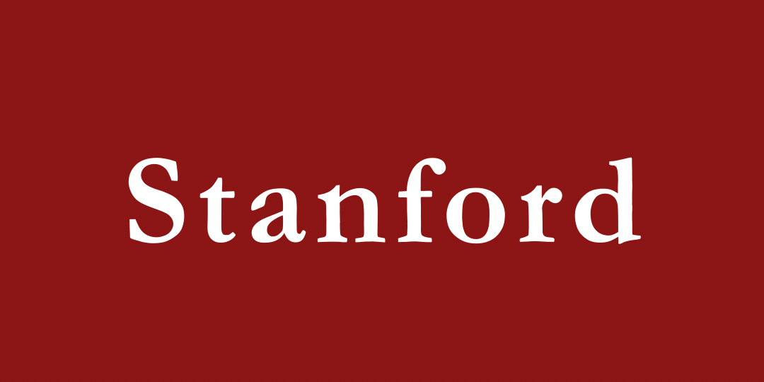

January 28, 2025 3:08pm: In an unexpected move, Stanford has rushed to comply with the Trump administrations’ OMB memo, which requires educational institutions to eliminate “woke” signals from its websites and communications. While many of the action items were accomplished relatively easily and with little reaction, such as the elimination of DEI centers, one is facing severe backlash from the students and supporters of the institution: Stanford branding has changed its font.
“When I woke up and saw the news, I cried,” Penny Lipinski (’28) lamented, “Politicians don’t even realize the harm that changes like this can place on regular people. What kind of world will this be for our children? A life Sans freedom? Sans dignity? We won’t stand for these hateful ideologies. It’s time for all of us affected and our allies to stand up and yell out: ‘We stand bold in the face of oppression.’”
Many students expressed concern that Stanford’s decision to change its font so quickly to comply with new federal regulations reflects cowardice in the university board. The Stanford community fears that this sets a precedent for creating more negative changes that directly impact student quality of life.
“It’s like, where do we even draw the line? First, they take our font and when no one says anything, who knows? Next it could be the cardinal red, then even our mascot tree’s species! I cannot, in good conscience, respect some random fucking sycamore on our signage,” Jessica Bakman (’27) wrote, in a letter to the Flipside editors.
There’s a lot of confusion and sadness surrounding Stanford’s submission to the government’s horrific demands, but of course, this was all to be expected, as we’re all still adjusting to what it means to be living in these unprecedented Times New.
Update from the Editors, January 29th: While Trump’s OMB Memorandum M-25-13 was rescinded in less than 24 hours, President Levin has released a statement expressing a deep regret at the quickness at which the university made the requested changes, and due to the millions of dollars spent on the worldwide rebranding, the Garamond font is here to stay.