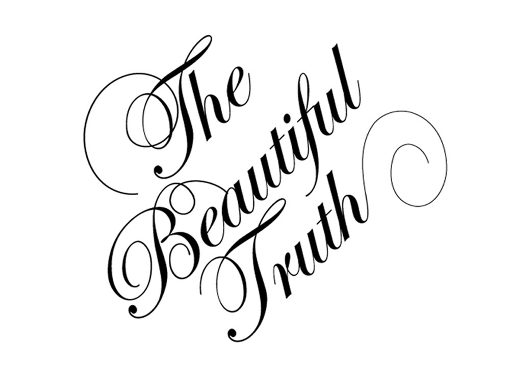
Labelling the other options as “bland” and “uninspired,” sources confirmed yesterday that sophomore Sam Bernstein chose “Transcendence Seraphim” as the best font for his first PWR 2 presentation.
“It just had such a good ring to it,” explained Bernstein, clarifying that the other popular staples like ‘Calibri’ and ‘Didactic Autumn’ simply weren’t going to cut it. “Those fonts might be fine for a paper,” he conceded, “but I’m going to need something with way more pizzazz, excitement, and religious connotation if I’m going to provide an effective visual argument.
”
Nonetheless, for all its merits, Bernstein did acknowledge that “Seraphim” is hardly applicable to other presentational methods. “Naturally, if I were using a Prezi, I would need something a little louder and more aggressive, like ‘Verdana’ or ‘Sensual Matterhorn,’ and if I were using Keynote, I’d need something a little more conservative and dignified, like ‘Baskerville’ or ‘Codswallop Winchester.
’ Ultimately our instructor told us that it just comes down to what your presentation needs to do.”
And what, exactly, does Bernstein’s presentation need to do? “Fuck if I know,” he informed reporters, shaking his head.
“PWR doesn’t teach us that.”


